What have you learned from your audience feedback?

The audience feedback was very positive, however there were a few comments and opinions which were slightly negative, although I do agree with some of the negative comments to an extent. Listening to opinions and feedback in any context is very important to help improve, and to spot aspects of the product which can be changed or edited for a better effect.
Comments and views that we received -

"Really had an 'indie' feel, well done!"
"Needs a clearer narrative"
"Should of Included more locations"
"Locations were boring"
"Taxi scene could have been done more dramatically, for a better effect"
"Lip syncing was flawless"
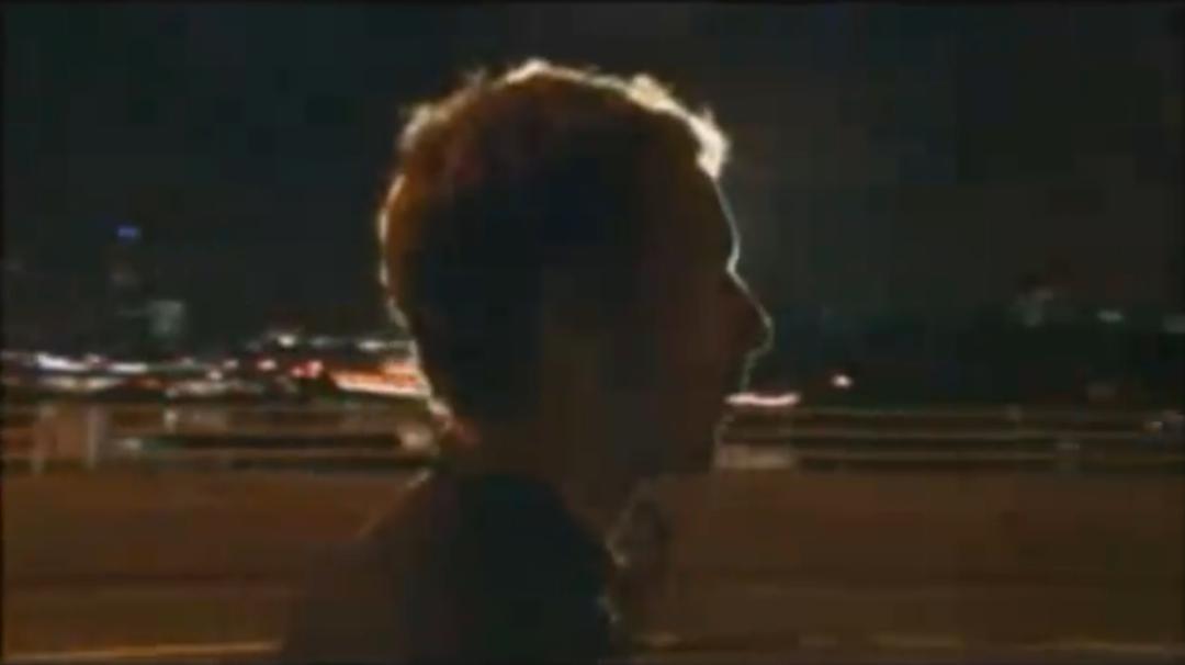
After really relentlessly analysing and deeply thinking about the comments made, I believe they are all correct and fair to an extent. "Really had an indie feel...", I fully agree with this judgement, the main influence over this specific comment may have been the walking tracking shots of our artist which is reminiscent in other indie videos and artists, such as The Verve, Coldplay and Radiohead.
"Should of Included more locations".Watching our music video back a few times we realised that the locations seem repetitive as we only used three primary locations, perhaps we could have included more locations during the planning stages. What would adding more locations result in? Well, possibly it would of generally made the video more interesting as a whole, although in my opinion the quality of the location/s used rather than the amount of locations is of more importance.
"Taxi scene could have been done more dramatically". I also agree with this opinion. Although I thought we captured the main purpose of the taxi scene, which was for sympathy and sorrow, shot lengths could have been longer so the audience connected and related more with the our artist and the female character in the video. Thinking back, this would have involved the audience possibly more than our finished video. Involving the audience creates a more personal connection with the audience which may have been even more effective.
Overall looking back at the feedback and the final cut of the video, in my opinion the video was successful. However, The comments made did make me see our video from a different light, such as from the point of view of the target audience, which was very helpful. If we were able to apply the feedback and make changes to our video I reckon we would not have made overhauling changes, keeping the core of the video as it is.
Feedback received on my ancillary products (advert & digipak) was also positive. Several comments were made on how it my products were at a professional standard and seemed professional. "All of the important conventions are included and very attractively used", I agree with this, however reflecting on the products I realised that in actual fact not all regular conventions were used, If I were able to go back and make changes to my products I most certainly would have included more conventions of a digipak and advert such as an inclusion of a competition on my advert, which was a regular feature whilst researching adverts.

Reactions in the cinema screening was rather good,our video was giving the 'awww' treatment near the end ( during the cab scene) which was followed by a warm round of applause after it was finished. Overall the reaction was very promising and much better than I personally expected.
The audience feedback was very positive, however there were a few comments and opinions which were slightly negative, although I do agree with some of the negative comments to an extent. Listening to opinions and feedback in any context is very important to help improve, and to spot aspects of the product which can be changed or edited for a better effect.
Comments and views that we received -

"Really had an 'indie' feel, well done!"
"Needs a clearer narrative"
"Should of Included more locations"
"Locations were boring"
"Taxi scene could have been done more dramatically, for a better effect"
"Lip syncing was flawless"
After really relentlessly analysing and deeply thinking about the comments made, I believe they are all correct and fair to an extent. "Really had an indie feel...", I fully agree with this judgement, the main influence over this specific comment may have been the walking tracking shots of our artist which is reminiscent in other indie videos and artists, such as The Verve, Coldplay and Radiohead.
"Should of Included more locations".Watching our music video back a few times we realised that the locations seem repetitive as we only used three primary locations, perhaps we could have included more locations during the planning stages. What would adding more locations result in? Well, possibly it would of generally made the video more interesting as a whole, although in my opinion the quality of the location/s used rather than the amount of locations is of more importance.
"Taxi scene could have been done more dramatically". I also agree with this opinion. Although I thought we captured the main purpose of the taxi scene, which was for sympathy and sorrow, shot lengths could have been longer so the audience connected and related more with the our artist and the female character in the video. Thinking back, this would have involved the audience possibly more than our finished video. Involving the audience creates a more personal connection with the audience which may have been even more effective.
Overall looking back at the feedback and the final cut of the video, in my opinion the video was successful. However, The comments made did make me see our video from a different light, such as from the point of view of the target audience, which was very helpful. If we were able to apply the feedback and make changes to our video I reckon we would not have made overhauling changes, keeping the core of the video as it is.
Feedback received on my ancillary products (advert & digipak) was also positive. Several comments were made on how it my products were at a professional standard and seemed professional. "All of the important conventions are included and very attractively used", I agree with this, however reflecting on the products I realised that in actual fact not all regular conventions were used, If I were able to go back and make changes to my products I most certainly would have included more conventions of a digipak and advert such as an inclusion of a competition on my advert, which was a regular feature whilst researching adverts.