In what ways does your media product use, develop or challenge forms and conventions of real media products?
The Verve's Bittersweet Symphony has obvious similarities to our music video and the video itself did influence us to an extent. Such as the various shots of the artist walking and singing, utilised with tracking shots. The camerawork is is also similar, focusing fully on the artist throughout the video. We also decided to completely focus on the artist through the video, as it seems a regular convention in most indie rock videos, with Coldplay's 'Fix You' using this same method, of focusing on the artist (video below).
Coldplay's Video - Our Video


As shown in the pictures above, we used a tracking side shot, like it was used in the Coldplay video, which worked very effectively in our video, it gave our video a sense of 'indie-rock'. We used and developed the forms and conventions of media products. Long shots were also utilised in our video, primarily because we saw them in the Coldplay and The Verve videos, e.g:

 Both videos, including our music video have extensive and consistent use of extreme and regular long shots of the artist. This seemed a indie music video conventions, therefore we applied it to our very own video. The result was very effective and clearly worked well with our song choice and video.


I also decided to remain close and use fully the conventions of the indie-rock genre for my digipak and advert (ancillary products).
My main source of inspiration for my ancillary products was The Kooks' digipak with their album 'Inside In, Inside Out' (images on the right -->). The style of a 'lack of colour' on the back and front panels with then a splash and wave of colour in the inside panels seems very effective, and it was the style which I tried to replicate with my digipak design. E.g. The wide panoramic extreme long shot in the inside panels of my digipak uses the natural colours, such as the vivid green and the colour of the trees, very effectively. I also added a barcode, website, and production and record label information which are general conventions of all digipaks and CD covers. These were essential to include, along with the niche indie conventions.
 The main inspiration for my magazine advert was a 'Muse' advert, which I came across in the initial planning stages of the advert. The first influence was the black backround, which instantly causes any other bright colour stand out much more, which is very effective. Also, only three colours are used in the muse advert, (Yellow, black & white), similarly only three colours are used in my advert (Black, dark red & white). However one difference is that I used a picture of the artist. The reasoning behind this is that our artist Mehmet Tarhan is a brand new up and coming artist, therefore a image of the artist himself is essential.
After scanning through many, many music videos of different genre and style we realised that our video will be of an indie/alternative persuasion. Initially however, we were set on producing an R&B song (Tonight by Jay Sean). Though, after not drafting any original ideas or concepts which were different to the original music video (which was a requirement in the brief) we abandoned the song. We went through other R&B songs and ballads, but we randomly came across, 'Bittersweet Symphony' by The Verve and 'Fix You' by Coldplay. We decided not to pull away from the indie-rock genre, in terms of our music video and thoroughly embrace the genre and it's related conventions, such as mise-en-scene, shot types and camera work.
The Verve's Bittersweet Symphony has obvious similarities to our music video and the video itself did influence us to an extent. Such as the various shots of the artist walking and singing, utilised with tracking shots. The camerawork is is also similar, focusing fully on the artist throughout the video. We also decided to completely focus on the artist through the video, as it seems a regular convention in most indie rock videos, with Coldplay's 'Fix You' using this same method, of focusing on the artist (video below).
Coldplay's Video - Our Video
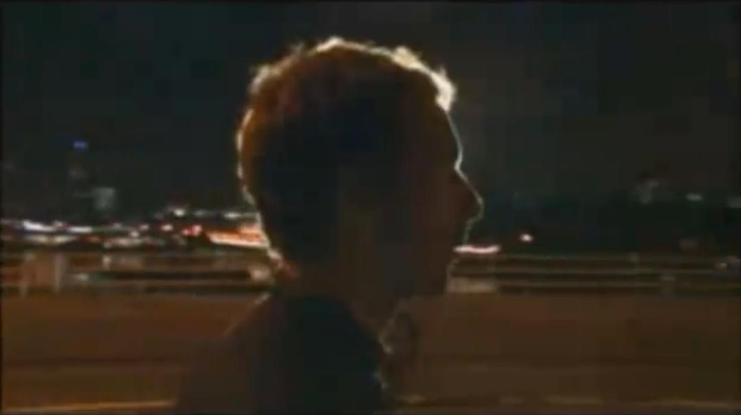

The Verve's Video - Our Video


The Verve's Video - Our Video


I also decided to remain close and use fully the conventions of the indie-rock genre for my digipak and advert (ancillary products).
My main source of inspiration for my ancillary products was The Kooks' digipak with their album 'Inside In, Inside Out' (images on the right -->). The style of a 'lack of colour' on the back and front panels with then a splash and wave of colour in the inside panels seems very effective, and it was the style which I tried to replicate with my digipak design. E.g. The wide panoramic extreme long shot in the inside panels of my digipak uses the natural colours, such as the vivid green and the colour of the trees, very effectively. I also added a barcode, website, and production and record label information which are general conventions of all digipaks and CD covers. These were essential to include, along with the niche indie conventions.

 The main inspiration for my magazine advert was a 'Muse' advert, which I came across in the initial planning stages of the advert. The first influence was the black backround, which instantly causes any other bright colour stand out much more, which is very effective. Also, only three colours are used in the muse advert, (Yellow, black & white), similarly only three colours are used in my advert (Black, dark red & white). However one difference is that I used a picture of the artist. The reasoning behind this is that our artist Mehmet Tarhan is a brand new up and coming artist, therefore a image of the artist himself is essential.
No comments:
Post a Comment