
Sunday, 26 December 2010

Saturday, 25 December 2010
Shortlist of fonts And Colours
The font styles i will be using on my digipak will be 'Ethnocentric' which shall be used for a vast majority of the information provided on the digipak such as, Album name, Artist name, track list and website URL's. The Font Type 'Century Gothic' is a second font type which will be used in my digipak. This font type will be used for my 'thank you' message on the inner panel.
The colours used for all the text on the digipak will be, Black, Grey And White. This is so that there is a housestyle created and carried out. on the album cover of the digipak the only colourful item which is visible is the image of the artist which makes the artist stand out and more eye catching to the audience.
The colours used for all the text on the digipak will be, Black, Grey And White. This is so that there is a housestyle created and carried out. on the album cover of the digipak the only colourful item which is visible is the image of the artist which makes the artist stand out and more eye catching to the audience.


Monday, 20 December 2010
Do's & Dont's - Digipak & Advert
-DO'S-
- Use clear font styles
- Use appropriate images, which are clear and well focused.
- Use only 3 colours
- Use general conventions e.g. barcodes, record labels, artist name, album name and track list.
- Use appropriate image sizes and font sizes
- Position text across artists image which may prevent identification
- Don't use unnecessary font styles, colours, and sizes which are irrelevant
- Do not stretch images
- Do not use unnecessary effects which have no relation to the genre
- Do not place an image on every single panel of the digipak
Analysis of adverts
album name 'Catch 22' provided above everything else as a header, along with the relase date to attract the audience. artist slogan in bottom right hand corner, bold large font.
 artist slogan in bottom right hand corner, bold large font.
 Artist name provided above all information for identification. album release date is in bold and a different font from other information so it stands out to the audience. record label, website, and also hit singles are provided to attract the audience.
Friday, 17 December 2010
Analysis of Digipaks
Front Cover
 This album i am going to do an analysis on is called 'Shock Value' by Timbaland. There is a longshot used on the front cover of the artist so the artist can be identified. This shot type is also used to capture the mise en scene used for the artist. for example, the artist is smartly dressed in a suit to give a rich look to the artist. the album name 'Shock value' stands out on the front cover as the colour chosen is completely different from every other thing visible on the album. The album name also has its own unique font style created for the artist to imply the album contains a different, unique style of music. The front cover of the album also has The parental advisory explicit content symbol which tells you that the album contains explicit language.
Back Cover

Shortlist of Fonts, Colours & Layout [Planning] - BEKTAS
Fonts I will use:
ARIAL BLACK
I will use three colours only, which are:
BLACK
RED
WHITE
I will create a 4 panel digipak and a landscape magazine advert.
ARIAL BLACK
I will use three colours only, which are:
BLACK
RED
WHITE
I will create a 4 panel digipak and a landscape magazine advert.
Analysis of Digipaks
Front Cover
 The album is by T.I. and is called paper trail. This album was designed in a unique way by Ian Wright as you can instantly tell by looking at the front cover. The conceptual idea behind the “Paper Trail” artwork was to come out with something more natural rather than the digitalized view every artist seem to be coming out with. The artwork is created out of scraps of newspaper, notebooks and other colourful paper products. The artist name and album are bold and in a contrasting colour from the image, therefor the artist name and album stands out.
Back Cover
The back cover of the album has also been created out of scrap pieces of newspaper, notebooks, and other colourful papers. The tracklisting has a conventional placement. record compay information, barcode, date and a website URL are also included on the back of the album. including website information is very important nowadays as internet is a popular source for gaining access to information of products.

Thursday, 16 December 2010
Album Name & Tracklist
Turbulence
- A Journey
- Don't Know What To Do
- Losing Touch ft. Ellie Goulding
- Run
- What I Really Want ft. Bruno Mars
- Runaway ft.Adele
- Put You First
- You Got It Wrong
- Beginners Luck
- Instability
- If Only ft.Mr Hudson
- Ordinary People


Friday, 10 December 2010
What We Aim to Put on the Digipak
1. Record label - Island Records.
2. Website details:
www.mtarhanofficial.co.uk
www.twitter.com/mtarhan
www.facebook.com/mtarhan
3. A couple of brief, one word headline reviews from some relevant magazines.
4. Thank You message to the fans.
5. Copyright notice.
6. Barcode.
7. Track Listing.
2. Website details:
www.mtarhanofficial.co.uk
www.twitter.com/mtarhan
www.facebook.com/mtarhan
3. A couple of brief, one word headline reviews from some relevant magazines.
4. Thank You message to the fans.
5. Copyright notice.
6. Barcode.
7. Track Listing.
Tuesday, 7 December 2010


Monday, 6 December 2010
Do's and Don'ts - Digipak & Advert - BEKTAS [Planning]

- Use clear fonts.
- Make sure the size of the images & fonts are appropriate.
- Apply rule of thirds for images.
- Follow genre conventions & the set house style.
- Try and use only 3 colours.
- Use general conventions, such as a barcode, copyright, titles, artist name, record label and track list.
- Think about using a form of graphic arts, only if it represents the genre.

- ABSOLUTELY do not stretch images.
- Do not use unnecessary effects. Use effects which are appropriate for your genre.
- Do not use unconventional fonts.
- Do not add images to every panel of the digipak, be creative.
- Do not use text over central images.
Sunday, 5 December 2010


Friday, 3 December 2010
[Task 26] The Do's and Do Not's of creating a Digipak - Mehmet Tarhan
Our digipaks must look professional, must be representative of our artist and most importantly, must sell the album. Therefore, we must follow guidelines to make sure that we don't miss out crucial pieces of information, such as websites of the artist, or the record labels name.
Do's
- Make sure to use clear and concise fonts.
- Use the rule of thirds.
- Try to limit the use of colours to only 3 specific and relevant fonts. (I.e not using gothic roman texts when the artists genre is something completely different.)
- Try to involve different types of images, not just pictures of artists from video (because you are representing the album not just one music video), think about using artistic images - but only if relevant to genre.
- Do follow conventions, making sure that you include artists name, track lists, record label, copyright notice, bar code, websites, and other relevant pieces of information that will promote your artist - such as adding reviews, but only one or two.
- Use your imagination!
Do not's
- Do not stretch images. They will look unprofessional and would give the opinion that the production was rushed and not carefully thought of.
- Do not use any over the top, or any effects for that matter, if your genre is not relevant.
- Be in line with industry standards, and do not misspell any words or phrases, do not forget labels, copyright notices, bar codes.
- Do not use images on every singly panel of the digipak.
- Do not cover up the artists face or body, or any other central images of the digipak with texts or effects.
Wednesday, 1 December 2010
[Task 25] Shortlist of Fonts, Colours, Design Ideas for Digipak
The digipak is meant to market and sell our artist as well as album, and we must incorporate a variety of features to make it stand out to the public, and our audience.
The fonts I will be using for my album cover will be bold, and clear texts. Specifically a mix of Eras Bold ITC for my 'thank you' messages in the inside panels, and for various pieces of writing on the actual CD inside the album.
For my websites details, and reviews as well as awards/nominations section, I will use Eras Demi ITC. The difference in the two are very subtly, but I do not want there to be a major difference in the fonts I use for my writing, because I want to maintain a similar house style throughout my fonts, and writing. But I decided to use Eras Demi for my website information because I did not want it to look the same as my track listing font, Eras Bold. The last font I used was called Agency FB, this was used for my album name on the front cover. I wanted it to be striking, and different, so I choose this instead of the other two, but with the point of keeping my house style the same, I only used it once.
Font rundown:
Agency FB Bold
Eras Demi ITC
Eras Bold ITC
Most of the colours I used were white, because my background art and pictures had a tint of green, brown, natural colours from the trees and grass were we got our pictures from, I thought that it stood out well. I put on a background colour of black on the fonts. I tried to create a rather dark atmosphere inside the album, with the shadows of the trees, and then a few rays of sunshine coming in, I thought it was very artistic and it looked great. My colour palette was dark/grey midtones for inside, and light/white tones for the outside, with the exception of the title.
The images I used were open spaces of the park and river, I thought it worked well throughout and, the image I put on infront of it was shot at seperately. I wanted to show the artists face, because that is who we were selling to the audience, so it was important they got to knew the artist before I told them about the facts, and website/record label information at the back.
Colour rundown:
Greens/Browns. Natural earthy colours.
Grey, Black, White.
I aim to produce a 4 panel digipak. I think this is best option because I will have space to put a thank you message in the inside panel.
The out panels will be composed of a picture of a wide longshot of the park in the video 'Run'. Its a good background to use, and I will be putting on a picture of the artist in the front.
For the inside cover, I will use a picture of a walking path in a canal. No one other than the artist will be in images, its meant to symbolise that the singer is alone, because his music also have a tone of loneliness and sadness about him.
Design rundown:
4 Panels (2 inside, 2 outside).
Artist in images only.
Tuesday, 30 November 2010


Monday, 29 November 2010
Evaluation of rough cut to final cut
in the beginning we wasn't really sure on what song to base the music video on and this took alot of time but we ended up choosing 'run' in the end because we thought it would be diffrent.
we had a few problems in our rough cut such us lip syncing, we managed to over come this problem by editing it to the beat.
also we had a few problems with filming because the weather was very bad so we had to end up doing a whole scene in a short space of time but as a team we managed to do this.
in our pitch we wrote that the girl character would be wearing white to symbolises purity but as we started to film we decided this would be a bad idea as the girl in our video isnt really shown as its ment to reamin a mystery.
Thursday, 25 November 2010
Sunday, 21 November 2010
[Task 21] Analysing One Sequence from the Rough Cut - Mehmet Tarhan
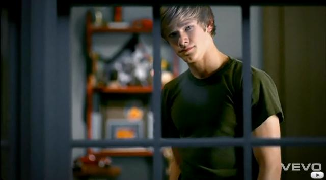
Having completed our rough version of Run, we received some well-structured criticisms about the video and ideas on how we could improve it even more. We were told that there shouldn't be too much difference from our rough cut and our final product, and we thought about ways we would change the video in a subtle manner, without ripping apart too much from our original storyline. We thought about changing the order of the shots, and we thought about how it would make the story much clearer. For me, the biggest sequence and most important sequence would be our final one, the final verse. This is crucially where we first and last see the girl that our artist is talking about, it was paramount that we nailed this. Making it clear that the girl is infact whom the artist has been signing about for the last few minutes, and making sure that the audience don't think that she is a random character, was the main idea to get across.
We firstly changed the brief shot of the girl, played by Tanzila, from colour to black and white, this added a picturequse feel to it, and it made me feel as though the shot of her eyes were a fading memory, and that is exactly what we wanted. We then added a shot of her walking towards a cab, again, we didn't want to show her fully because we want her to be mysterious and want to make the audience themselves think about whom it may be, or what sort of personality they may have, without us directly telling them. This I think was a good shot to add, because it shows that she is leaving someone, and then we see another added on shot of our artist breifly looking into the cab, while Tanzila closes the window on him. I think it shows that the girl doesn't want to be involved with our artist any longer, and so was a good addition. Our last addition was the shot of our artist walking away from the camera at the end, it was good because we saw that he is on his own now, walking away and leaving the previous events behind him.
Another key point of interest was our lip syncing, we received a fair amount of critism there, and we set about fixing the minor issues in our first verse, and some in the third.
I think we managed to execute our plan, and managed to do so subtly, and I believe that the finished product is undoubtedly even better than the rough cut, because we acted on the issues that needed fixing for it not to be a good piece of work, but for it to be a great one.
Saturday, 20 November 2010
[Task 19] Feedback from Rough Cut - Mehmet Tarhan
We presented our initial rough cut to the class, and the feedback we received was appreciated and we were very happy to have finished after a very busy period for us.
Firstly, because we had been under time constraints after a rather slow start to the filming process with slight problems in casting, and then even more so after weather disruption forced us to cancel up to 4 hours of filming time. However we still managed to put it all together, with some time to spare even!
Secondly, the feedback we received highlighted some issues in our lip syncing that was not obvious to us. I think it was great to showcase our work, because 2nd, 3rd and 4th opinions really helped improve our work, because we may have been too lenient seeing as though it was own work, which could of brought our standard of work down.
Finally, the overall criticisms were not on anything major that we needed to re-film, they were thankfully on small issues, like order of shots, or length of shots.
Friday, 19 November 2010
Rough cut Feedback + Analysis - BEKTAS
(Rough cut video in seperate post)
The group's initial reactions of the rough cut were slightly negative, the potential of our footage to be a great music video was there, with which our teacher and the rest of the class agreeing to this, but the editing definitely has be executed and improved for the video to fulfil it's full potential in the final cut of the video in my opinion.
 The reason for the slightly 'off' editing was probably because of our time constraints. As we had not been able to film our last shots of the sequence due to weather restrictions on previous filming days, we had to get our footage on the day the rough cut was due to been screened to our teacher and to the rest of the class. This was the major reason of the 'rushed' looking editing. However, although the rough cut was fast tracked a good video still emerged. Lip-syncing was a little off in some areas, but it will most definitely be priority in the editing lessons we have left until the final cut video. We also found that the cuts in the video could be better placed in some sections of the video, the longer cuts have to be shortened, as it seems they drag and slow the pace of the video. Also, shot transitions, such as cross and additive dissolves need to be incorporated more into the video.
 A specific area, or section of the video I want to look at is the lip-syncing. Throughout the second verse in the park some shots seem to be out of sync with the soundtrack, which will most definitely have to be addressed in order to gain a higher mark. Seeing as that re-shooting the sequence is now unavailable we have to try perfect the lip-syncing with the art of editing. One possibility and answer may be to slow or speed up the shots in question which are out of sync, in order to bring them in sync with the soundtrack.
The group's initial reactions of the rough cut were slightly negative, the potential of our footage to be a great music video was there, with which our teacher and the rest of the class agreeing to this, but the editing definitely has be executed and improved for the video to fulfil it's full potential in the final cut of the video in my opinion.

 A specific area, or section of the video I want to look at is the lip-syncing. Throughout the second verse in the park some shots seem to be out of sync with the soundtrack, which will most definitely have to be addressed in order to gain a higher mark. Seeing as that re-shooting the sequence is now unavailable we have to try perfect the lip-syncing with the art of editing. One possibility and answer may be to slow or speed up the shots in question which are out of sync, in order to bring them in sync with the soundtrack.
Thursday, 18 November 2010
Thursday, 11 November 2010


Tuesday, 2 November 2010
Vladimir Propp - BEKTAS [Research]
.jpg) |
| Vladimir Propp was a formalist who analysed elements in a narrative. |
Propp's character theory is intriguing, he looked very deeply in character types and how these worked in pieces of work he analysed. Propp came to a conclusion that there were eight character groups in which all characters in a narrative would be categorised in some way. These are:
- The villain - the anti-hero, an antagonist to the narrative.
- The donor - helps the hero in some way, provides the hero with a significant object.
- The magical helper - Aids the hero in his/her adventures.
- The desired prize or princess - the hero deserves this throughout the narrative, but is unable to because of the anti-hero.
- Her father - the 'father' can have 3 different roles in a narrative. There are challenging the hero, identifying the false hero and marrying the hero. Propp himself stated that the princess and father roles may be indistinguishable when applied to a narrative.
- The dispatcher - reminds the hero of his quest and sends him on his way.
- The hero - Weds the princess, listens to the donor and accepts the challenge.
- The false hero - claims the real hero's merit and tries to hijack the quest.
When researching a music video which can be applied to this theory I came across Taylor Swift's "you belong with me". The video includes 3/4 of Propp's character ranges shown below.
 |
| The Hero |
 |
| The Villain & Antagonist |
 |
| The Princess |
Monday, 1 November 2010
Review of research & planning blog activity tasks
Hello Group 19
Congratulations to Bektas for a mostly up to date blog. Tanzila, there is still a lot of work to do - you mostly need to finish off posts and include images / embed videos etc... Mehmet and Tahid, you are VERY BEHIND. Your blog is worth 20 marks so requires effort and maintenance, you have put so much detail into the planning of your production and your pitch but your blogs don't reflect this, which is a real pity.
Please see below for the work that you need to catch up on - what you are missing in general as a group and what each of you needs to do indiviudally.
GROUP 19 | |
General Summary | · Bektas has done a lot of work and is up to date except for some tasks that none of the group have completed. · Mehmet & Tahid are VERY BEHIND with a lot of work to catch up on, mostly from the research stages. |
Whole group needs to include the following: | · Animatic · Propp – review of theory & application of theory to a music video (this is an individual tasks that you all need to do) · Letter from record label confirming copyright clearance · Test shots for lighting / mise en scene |
Mehmet | · Analysis of music videos relating to 4 concepts · Summary of Goodwin’s theory · Examples of videos that have illustration, amplification, disjuncture narrative · Review of previous student video · Reflection on lip synch tutorial with images & embedded video · Final song choice with link to video & explanation for use |
Bektas | · Up to date (except for ‘whole group’ tasks that need completing) |
Tahid | · Analysis of pop video relating to 4 key concepts · Examples of videos that have illustration, amplification, disjuncture narrative · Review of previous student video · Reflection on lip synch tutorial with images & embedded video · Final song choice with link to video & explanation for use |
Tanzila | · Previous student video · Lip synch exercise – almost complete but need to include photos and embed video · Final song choice with video & explanation for use |
Final song choice
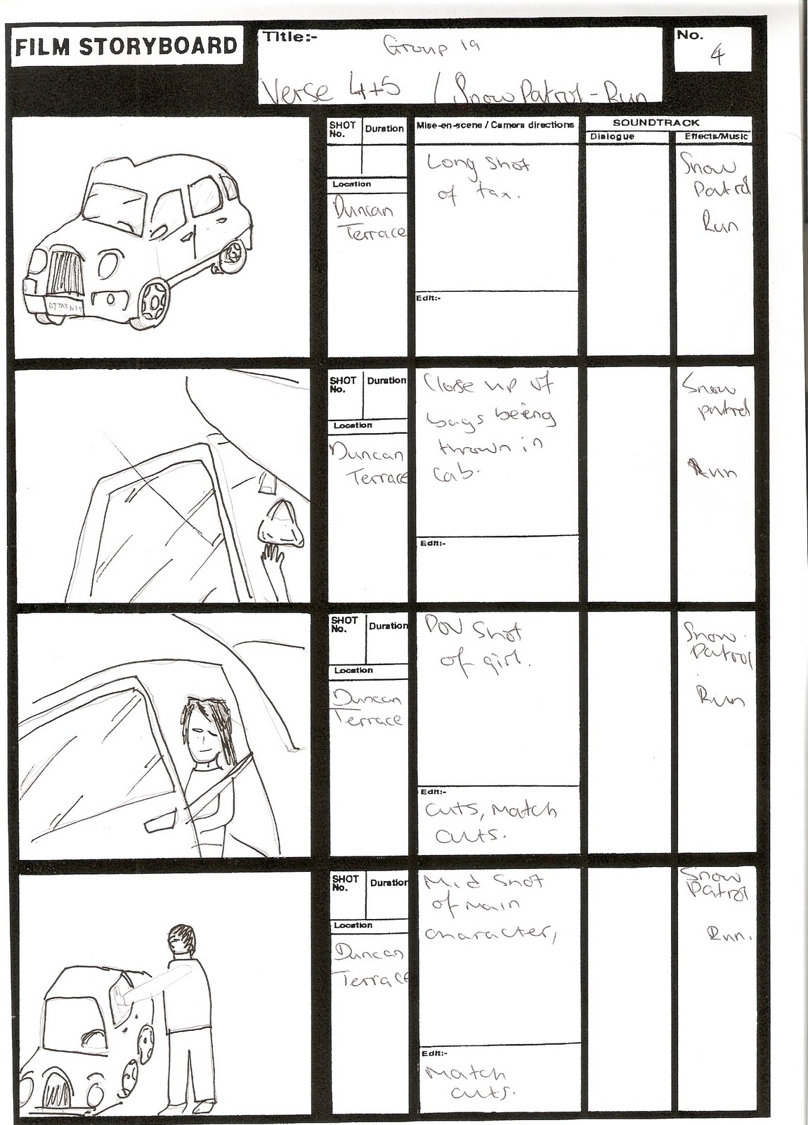
For our final song choice we decides to do RUN by Snow patrol.
we thought this would be a good song choice because it's not to everyones taste and we wanted to be different.
we thought this would be a good song choice because it's not to everyones taste and we wanted to be different.
Audience task
Male && Female
Surbabian
18-28--->>Students/Graduates/Employed
White- British
Students-looking for a job
Diet-->> fish && chips, unhealthy foods, rarely any fruit or salad
Spare time--> Jogging, mostly at home on there PC social networking[facebook/twitter], watching music videos on youtube and going cinemas with friends.
Books/ newspapers/magazines----> Metro & Evening standard.
Short list and rolling stones.
Transport--> Public but sometimes bike and car.
Gadgets-->Game consoles [ps3], smartphones, pc's and ipods.
Shopping-->
Topman/river island/h&m
Drink-->energy drinks
Holidays--> within europe.
Taste on music--> indie/ slow songs[cold play/arctic monkeys]
Reformers with aspiration!
B/C1
Friday, 29 October 2010
Thahid - Lip Sync Tutorial
In class we were given a tutorial on how to create lip sync in a video. The task of lip syncin a sample video was then carried out using the software 'final cut pro'. Tools were used which helped keep clips in sync with the sound wave. This task helped me familiarise with the software final cut pro and get the hang of using all its tools and learn how to use basic features. at the end of this task i had a finished lip sync music video which was perfectly in-sync. This task was very useful as it will help with the editing procedure of creating the music video.
Monday, 25 October 2010
Thahid - Final Song Choice

Saturday, 23 October 2010
Thahid - Analysis Of Previous Video
This music video from previous years students has been produced to a very high standard, which almost seems to be produced by professionals. This video cuts in to the category of indie-rock genre, as it is clearly represented in the video through sound and mise en scene. In terms of Goodwin's theory this video would fall under the 'amplification' category.


The editing includes alot of medium paced cuts which allows the video to flow. There are a variety of shots used such as, extreme long shots, medium shots and close ups.
Tuesday, 19 October 2010
Monday, 18 October 2010


Potential Locations [Planning]
 |
| Duncan Terrace - N1 |
 |
| Barnard Park |
 |
| Barnard Park |
 |
| Regents Canal |
 |
| Regents Canal |
Subscribe to:
Comments (Atom)